It’s the end of April. I’m writing that opener almost like it’s a slightly bewildered revelation rather than a statement of fact. A third of the way through my bookshop year and it hardly feels like a week has passed, let alone all the seconds and minutes I’ve spent at the coalface of indie bookselling.
There is a kind of soothing aura of calm that permeates a bookshop. Like sitting on the wooden steps of a groyne-lined beach listening to the waves gently ripple over shingle, while staring far off into the distance. This month on the beach I caught sight of a fata morgana, a natural optical illusion where it looks like a boat is floating just above the horizon. It was a rather wondrous experience, despite the fact I knew it was just a mixture of warm air and light playing tricks with my eyes.
It’s kind of the same with the bookshop. I mean it’s just a load of old paper and ink, sitting on rows of wooden shelves, literally speaking, and yet people pop in time and time again, and when they do, stick around for a while. Browsing, some call it; others, passing time. It is why, when I’m polishing the shelves, and working in a bookshop there’s a lot of polishing of shelves, I can tell you, that I really think about how a customer might interact with the sight I’ve left before them. I have a friend whose book shelves are colour coded and another chum who has a whole wall full of those glorious old Penguin covers. Aesthetically, some book covers look so good, you could place a frame around them and stick them on the wall.


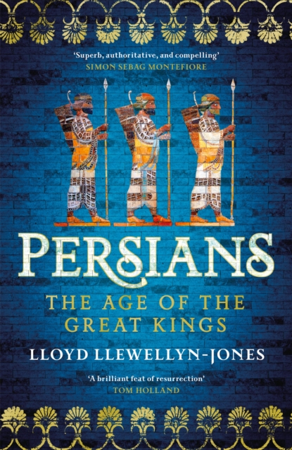
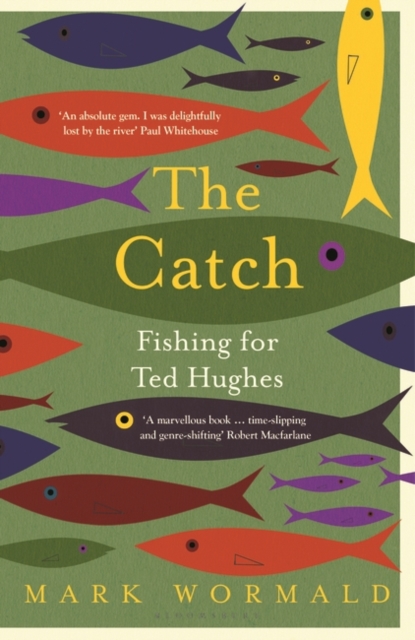
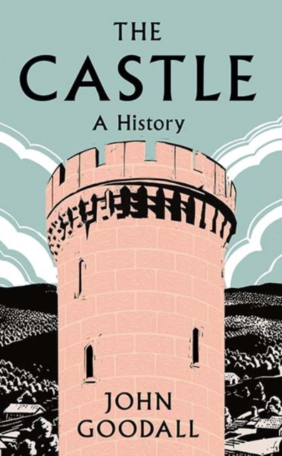
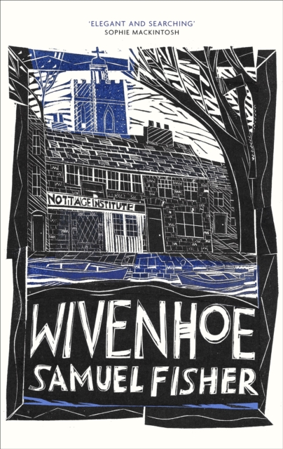
At the moment, that includes, but is not limited to, The Catch by Mark Wormald (Bloomsbury), a glorious book about the poet Ted Hughes and his love for fishing with an eye-catching design by David Mann. Then there’s Lloyd Llewellyn-Jones’ history book, The Persians (Headline) with its suitably exotically enticing image, and John Goodall’s The Castle with linocut by Jo Walker. Being a Wivenhoe boy I’m a sucker for a linocut, and so it would be remiss of me not to mention Samuel Fisher’s Wivenhoe design by his good friend Jonathan Gibbs, and fictionally speaking what about Tom Benn’s Oxblood (Bloomsbury), photo by Thomas Blower (The Bus, Manchester 1980s) and the gloriously stylish Lessons in Chemistry (Transworld) a cross between Mad Men and The Big Bang Theory courtesy of designer Beci Kelly.


I’ve rather enjoyed writing this column because it’s given me a chance to herald the unsung heroes of bookselling, the cover designers. While I’ve been polishing the stands, they have given me untold pleasure, and even on a few occasions, tempted me to buy the book. I mean that’s what it’s all about, after all – and of course the polishing.
Neil Jones, April 2022
